Visualize with Grafana
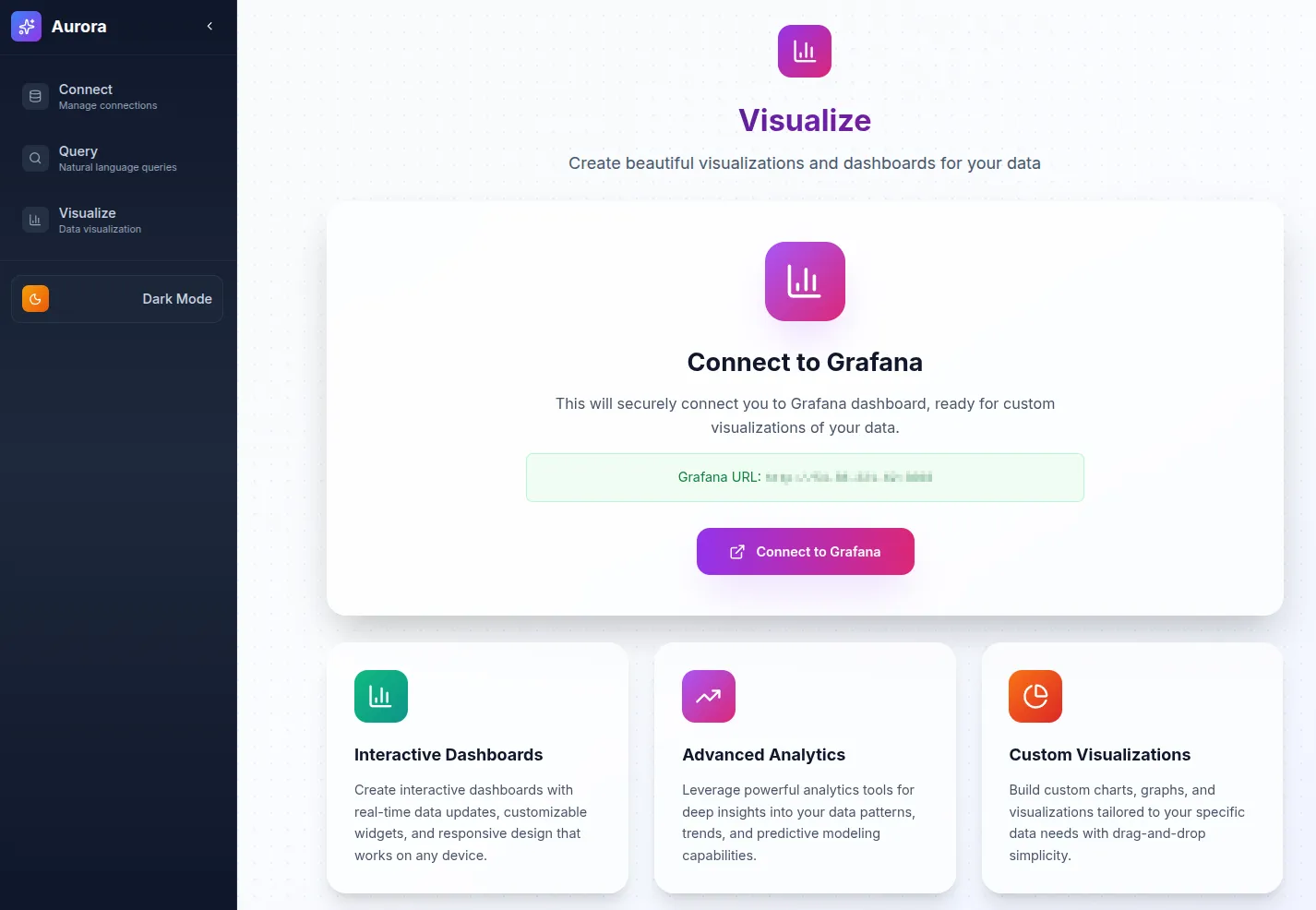
The Visualize page provides access to Grafana dashboards for advanced monitoring and analysis of your Kafka data streams. Aurora comes with a preconfigured Grafana instance, so you can start exploring your data with professional-grade visualizations immediately.
- Access the Visualize Page
- Navigate to
/visualizein your web browser, or click Visualize in the sidebar. - The page provides a link to your preconfigured Grafana instance.
- Navigate to
- Open or Create a Dashboard
- Select an existing dashboard, organized by data type and use case.
- Or create a new one by clicking + New Dashboard.
- Customize Your View
- Adjust time ranges using the time picker.
- Apply filters to narrow your data.
- Switch between visualization types (tables, graphs, heatmaps, etc.).
- Add Custom Queries
- Click Add Panel to create a new visualization.
- Use the query editor to write custom ClickHouse queries.
- Choose from chart types such as line, bar, or pie.
- Save and Share
- Save dashboards with descriptive names.
- Share dashboards via links or snapshots.
- Export data or images as needed.
Grafana Basics
Section titled “Grafana Basics”- Time Range: Use the picker in the top-right corner.
- Refresh: Click the refresh button to update data.
- Fullscreen: Use the fullscreen icon or press F11.
- Edit Panel: Click any panel and select Edit.
Quick Grafana Tips
Section titled “Quick Grafana Tips”- Use
$__timeFilter()for automatic time filtering. - Leverage ClickHouse functions like
uniq(),quantile(), andgroupArray(). - Create template variables for dynamic filtering.
- Enable auto-refresh for real-time monitoring.